Posts

CCR

Here is the Creative Critical Reflection: https://www.youtube.com/watch?v=I0deWcpzyho

Introducing LOCATION - Travel Magazine

Image
Here is the final product!

Double Page Spread Done!

Image
Finally I finished my double page spread. Here it is: One obvious difference is the background color. I changed it because it deviates from normal magazine conventions, and it simply looked more childish. Besides that, I basically just added my article and did a couple of finishing touches. The final product is basically the same as what I have posted for the table of contents and cover page. The next two posts will contain my final product and CCR.

Article Research

Image
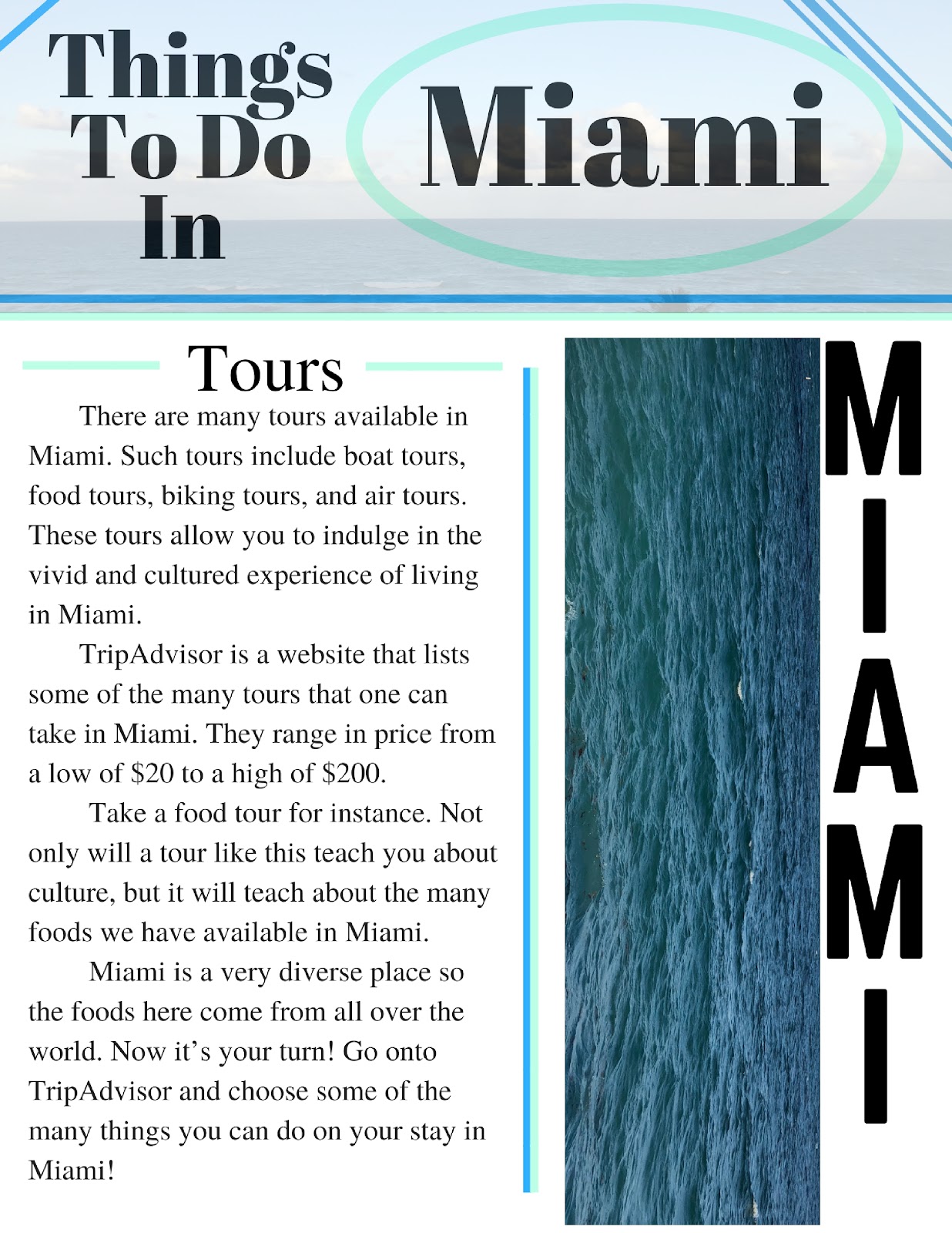
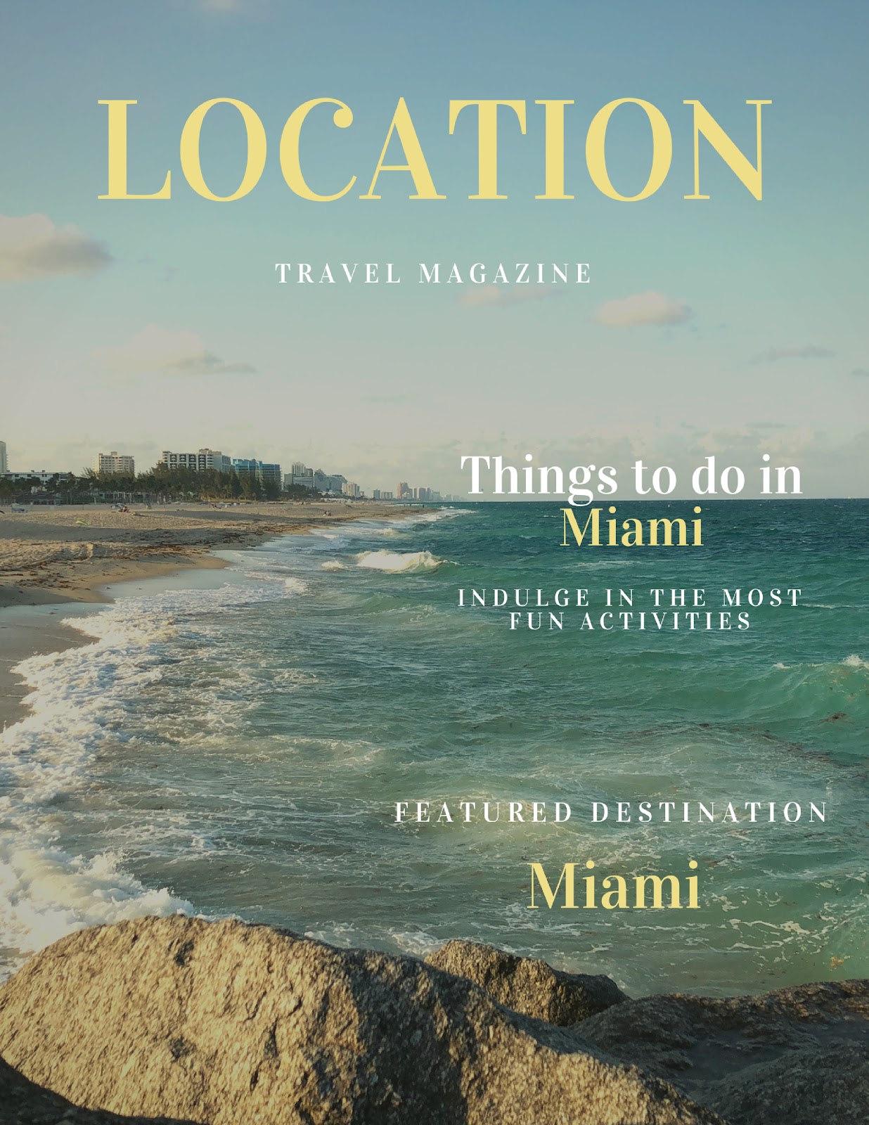
From the last feedback session, I got the idea of doing “Must-do Things At The Beach” as my main article. I will do some research and include the double page spread draft for this part of the project, since it is half of my entire magazine. Besides, the beach there are many things that one can do in Miami. This includes going on tour buses, eating at restaurants, and simply enjoying the warm sun. Enjoying the sun can be done in many different ways with affordable prices that I will probably include into my magazine. Here are some more topics that I can write about for “Must-do Things At The Beach”: - Water Sports - Food Tours - Air Tours - Relax at the beach - Biking Tours - Water Tours These are the main topics, and I will cover those that I believe I will be able to more easily convey through writing. Regardless, I also want to share the double page spread draft. Here is the draft: For the most part I plan I using the picture I have there as one of the ma

Final Feedback Session

Due to the great feedback session from last time, I will now share the results from this one. The main results have been shown through the last two posts with the cover page and table of contents. While I didn’t get this feedback primarily from the session, I accumulated feedback (from others) to produce what I had to produce. For instance, the cover titles were changed because of the positioning I had last time. I also change the color of the font which allowed them to be more easily read. In addition, although I didn’t receive as much feedback from the table of contents, I was told to add a part with sections that way the audience doesn’t only have 4 pages set as landmarks to the entire magazine. Adding this section would simply make it easier for the reader to navigate through the entire magazine. Lastly, I got the idea that I should do “Must-do Things At The Beach” as my main article because those are usually entertaining to a greater percent of the population. Overall, th

Table Of Contents!

Image
My table of contents is now complete! Here it is: Just like the cover page, this is practically complete and is subject to change, although for the most part this is how it will end up staying.

Cover Pageeeee!!

Image
After enormous amounts of trial and error and using filters to improve the look and match the color palette, I finally got a great look! Here it the cover page: Keep in mind this is basically the finalized version simply because I am running out of time to continue making changes. Regardless, I am very happy with how it came out. The process of creating this however, was not so easy… First of all, I had the problem of not having a portrait mode photo. This could decrease the quality of the picture simply because it would need to zoom into an area of the picture since it was originally in landscape mode. However, it turned out great after I applied the filter to the pictures. Not only did the filter make the quality fo the picture look better, but it creates a warm and soft vibe to the magazine. This is what I was aiming for since Travel magazines are meant to relax the audience. Secondly, I kept the font of all the text the same since it will allow the reader to more eas