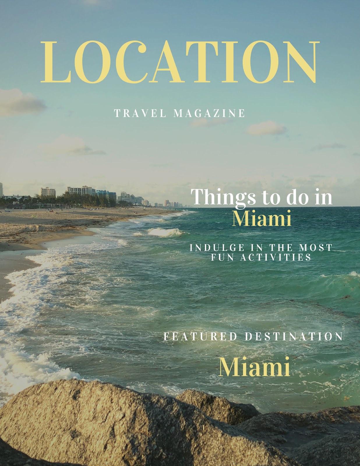
After enormous amounts of trial and error and using filters to improve the look and match the color palette, I finally got a great look! Here it the cover page: Keep in mind this is basically the finalized version simply because I am running out of time to continue making changes. Regardless, I am very happy with how it came out. The process of creating this however, was not so easy… First of all, I had the problem of not having a portrait mode photo. This could decrease the quality of the picture simply because it would need to zoom into an area of the picture since it was originally in landscape mode. However, it turned out great after I applied the filter to the pictures. Not only did the filter make the quality fo the picture look better, but it creates a warm and soft vibe to the magazine. This is what I was aiming for since Travel magazines are meant to relax the audience. Secondly, I kept the font of all the text the same since it will allow the reader to more eas...